
Each year the famous Pantone® Colour Institute beguiles us with its ‘colour palettes of the year’. As you probably know, 2020’s number one colour is ‘Classic Blue’. Classic Blue, we’re told, was chosen because it instilled a:
“Calm confidence and connection… highlighting our desire for a dependable and stable foundation on which to build as we cross into a new era.”
Did they know more than they were letting on? Revisiting that description in the light of the ‘current era’ made us wonder what they had up their sleeves for 2021.
Leatrice Eiseman is a leading colour expert. She is also the executive director at Pantone, and as such she heads up the panel of experts who creatively predict our colour palettes for the following year.
Eiseman was due to give a keynote speech at this year’s Chicago’s Inspired Homes Show – a key trade fare for the industry. But, as with many big events, the show has been rescheduled for 2021. Eiseman’s talk was entitled “Innovation: The Key to Success Through Colour + Trends” and it’s now been published. So we thought we’d borrow her crystal ball and find out a little more.
Inspirational industries
Eiseman and her team look to several different industries for colour trends and inspiration. The worlds of fashion, art, cosmetics, electronics, cars, films and television figure large.
She predicts the film industry will become even more significant as our main source of entertainment. ‘Avatar 2’, for example, and due for release next year, this time takes place underwater and features “sleek styling and vivid blues”.
Puzzled as to what the movie industry has to do with interiors? The answer is the ‘trickle-down effect’. It apparently makes us all more ‘open’ to the idea of colour.
Wellness
A theme we’d all like to embrace a great deal more at the moment! For interiors that means soft, familiar hues which ‘can convey a sense of calm and comfort’.
Sustainability
Eiseman admits this is nothing new, but now more mainstream. “Many consumers around the world are now demanding products and practices that are environmentally friendly. They’re choosing home environments and colour schemes that reflect this,” she explains.
The big reveal
Eiseman’s keynote speech revealed the ‘Nine 2021 Pantone View Home + Interiors palettes’…. so insert your own drum roll here:
Folkloric
This palette is Nordic in feel. “It’s really about a new and energized form of folk art,” she says. It features deeply saturated authentic colours that look handmade. These shouldn’t look like they were made with chemicals, and include indigos and fern greens.
Terracotta
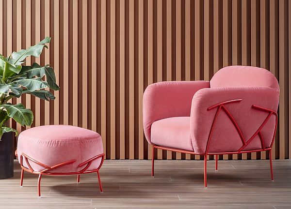
This features a warm, earthy colour that appeals to people in just about any culture. Though Terracotta is the ‘star’, it appears alongside a sliding scale of warm earthy tones but with a few very unexpected colours, such as ‘Lilac Sachet’.
We absolutely love this combo! Spotted on some recent styling by Bonaldo with their fab Corallo chair, styled here in deep pink and set against a terracotta backdrop. Gorgeous isn’t it.
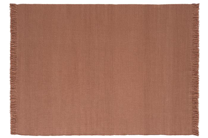
And for a spot of solid terracotta there’s no beating Nani Marquina’s hand-dyed rugs.
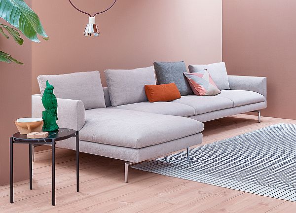
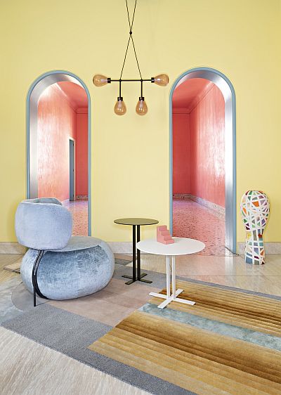
Composed
“This is the palette that is always necessary for those consumers who are comfortable with neutrals,” says Eiseman. Here, soft pinks and blues “lighten the load of grey” to combine with hues like Glacier Gray and Granite Gray.
That works for us too.
Vivify
The yang to the yin of ‘Composed’. Vivify is apparently “an eclectic grouping” of playful and cheerful colours such as Easter Egg blue and Meadowlark. Black and white are included as well to create a dichotomy of sorts.
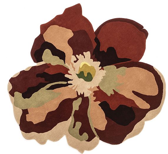
Fleur
Flowers are an age old influence on colour. However, this palette is “not just about a sweet bouquet,” Eiseman tells us. It’s “a bit sexier” with the inclusion of some deeper wine or merlot hues, and includes some green for balance.
And Nani Marquina has already nailed this one with her beautiful new rug collection Flora. Powerful floral designs with breathtakingly intense colours.
Quixotic
This vibrant palette features some closely matched colours. But it also goes right across the colour wheel to find some unique contrasts. These include: Jade Lime x Peppery Cayenne and Papaya Punch x Tranquil Blue Sky.
And then comes…
Polychrome
This colour palette is “very much about patterning”. It’s inspired by architectural details from many countries with colours such as Dijon-enriched spicy mustard and Mocha Mousse.
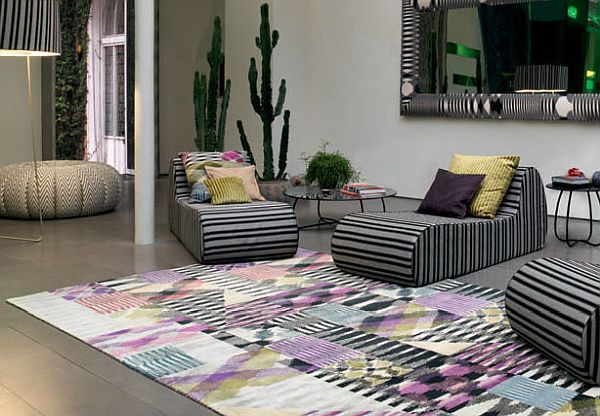
We’re not generally into pattern at Go Modern but if you’re in search of stripes, florals, zigzags or a whole rainbows worth of colour then our Missoni Home collection will keep you happy for hours.
Synergy
And Missoni Home also adds contentedly to Eiseman’s next palette – Synergy. A combo of blues and blue-greens always a favourite of some, so this palette uses them to create “peaceful, pleasing connections of colour”. Greyed-down versions of blue and blue-green contrast seamlessly with other colours such as greyed-down lilac or mauve.
And finally…
Galaxies
Not so much the stars and planets. More shiny metallics.
This is definitely an ongoing trend and certainly one that our manufacturers and customers have embraced for the last few years. Eiseman tells us this is inspired by “the ongoing fascination humans have with the galaxies that lie beyond”. The difference here is that this palette requires metallics to sit alongside earthier tones to help ground them.
So dust off your crystal ball and have some fun. We’ll be keeping an ongoing eye on all of these colour palettes. Some interesting combos and exciting trends. It won’t all be your, or our, personal cup of tea but hopefully there’s something there to inspire you.