
Well what a roller coaster of a year it’s been. We thought it was time to try some calming ‘colour therapy’ with a little look at what our leading colour forecasters and paint companies are recommending as next year’s colour trends. Here’s looking at you 2021.
We’ve selected some of our favourite shades, paired with some of our own designs, to complement or reflect the trends.
Pantone
Hot off the press with their announcement today, this leading colour trends forecaster has predicated that 2021’s colours will bring “A message of happiness supported by fortitude”.
This can be achieved, according to the people at Pantone, by pairing grey and yellow. Or, their shades of Ultimate Gray and Illuminating. These two independent colours ‘highlight how different elements come together to support one another’.
“Practical and rock solid but at the same time warming and optimistic, this is a colour combination that gives us resilience, and hope. We need to feel encouraged and uplifted; this is essential to the human spirit” – Leatrice Eiseman, Executive Director of the Panton Colour Institute.
Farrow & Ball
It’s more or less the same message from leading paint company Farrow & Ball. Although the colours are different.
“In challenging times, we crave warm tones that will enrich our homes and create cosy sanctuaries away from the outside world.” So says Joa Studholme, Farrow & Ball’s Colour Curator.
Farrow & Ball have curated a number of different ‘colour moods’ for the year to come including the key shades that help to create them. Joa explains the thinking behind some of our favourites:
“In 2021 we have moved away from dark charcoals and towards the warmer tones of nature, like Deep Reddish Brown and Tanner’s Brown, which are both luxurious and soothing”.
It’s not hard to see why we’re all craving these richer, earthy tones. There’s definitely something grounding and comforting about them.
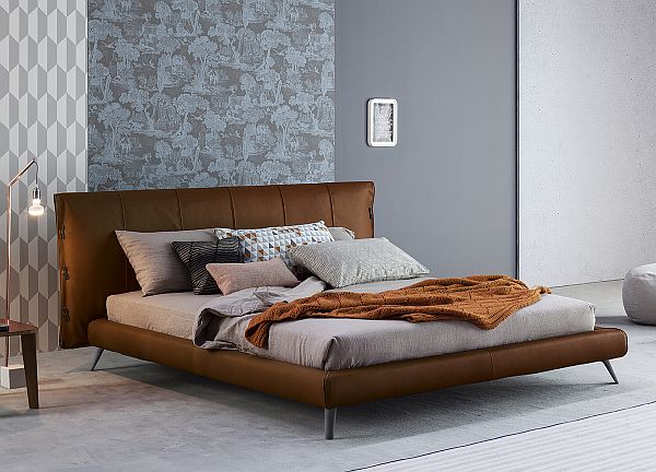
Tan leather is always a popular choice for upholstery and as Bonaldo’s Cuff bed shows here its look is luxurious, warm and comfortable – perfect for the ultimate sanctuary of a bedroom.
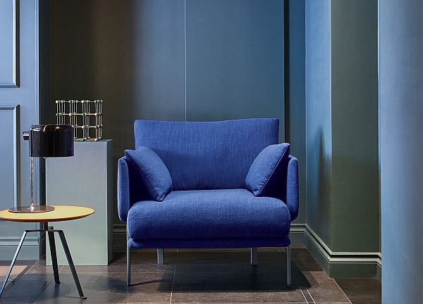
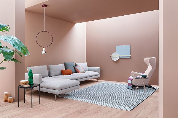
‘Clean timeless blues’
Blue is a perennial favourite for lots of us. It comes in a multitude of shades but for 2021 Farrow & Ball recommend the more familiar, uncomplicated shades. Blues that will have a soothing effect on our interior spaces. Their popular Pitch blue and, our favourite, Stiffkey blue are amongst the choices.
“The beauty of blue is also its versatility”, says Joa. For a more traditional look she recommends pairing blue with shades of white. Or “for a simple but immersive colour experience,” she adds, “use the same colour on walls and woodwork”.
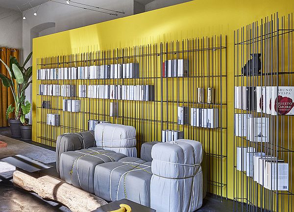
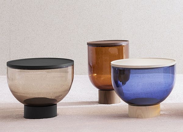
For colour pops of these wonderfully warming, reassuring colours also take a look at Miniforms’ Mastea coffee tables which are offered in beautiful shades of blue/grey or amber Murano glass.
Graham & Brown
Based in Blackburn, Lancashire, the excellent Graham & Brown wallpaper/paint company was created in 1946 by Harold Graham and Henry Brown. The company is now run by a third generation of the family and their reputation has grown worldwide.
Graham & Brown’s 2021 colour trends prediction is Epoch. Or a rich plum to you and us. They describe it as:

“Proud, regal and luxuriously bold.” They go on to say, “It can be used in many different ways throughout the home to give varying levels of drama so don’t be scared to introduce it even if you prefer schemes that are a little less daring! Create sophisticated tonal schemes by pairing with soft lavenders. Rich teals will give you a peacock inspired haven and if playfulness is your thing – pair with peach tones or pops of pink for a gorgeous wow factor!”.
Dulux
It’s another ‘warm, earthy tone’ from Dulux paints. Founded in the 1930s, Dulux feels like it has been with us forever. And so does the dog. Apparently there have been 14 since the original was introduced in the 1960s!
The Dulux colour experts this year have chosen Brave Ground™, which they describe as, “a bolstering shade that connects back to nature and the simple things”. They also tell us it, “creates a feeling of stability, growth and potential; and provides a firm foundation for change and creativity in your home.”
So, there it is again, that focus on ‘grounding’ shades and positivity.
“What has emerged from our trend forecast this year,” they tell us, “is that we’re all reassessing what really matters in our lives. We’re taking stock and finding a new and positive way forward by having faith in ourselves, working together, building on the past and planning for the future”. We’ll second that.
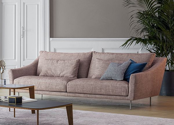
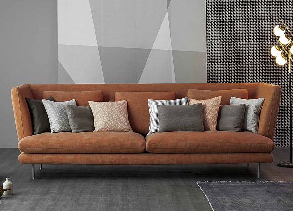
Against a similar warm, neutral shade seen here, Bonaldo’s Skid sofa, in Milos fabric, a cotton/linen mix in dusky pink, it proves to be a great combination. Reassuring and calming, with the dusky pink of the sofa fabric adding more warmth.
Crown
It gets a little more involved with Crown’s colour trends this season. With a heritage dating back to 1777 the company moved into paint in 1904. Looking ahead to 2021 they have three colour palettes on offer around the themes of: Antidote (featuring a thick, luxurious green), Naturally Perfect (dusky pinks, rose and metallic roses), and Structures (shades of concrete grey). And they all complement beautifully.
Their colour expert Kathryn Lloyd tells us that colour is a “great tool”. Kathryn also recommends however that, “as people, we should step away from thinking about colour just as decoration and start thinking about how colour can influence how we think and how we feel”.
In brief: ‘Antidote’ is just that: the antidote to our busy lives.
‘Naturally Perfect’, according to Kathryn, is a trend that “is all about society’s preoccupied obsession with the aesthetic and as a result Naturally Perfect is a nod to a modern Art Deco representing luxury and early Hollywood glamour. Emphasis is on curving forms and long horizontal lines.”
We love the sound of this and are particularly taken with their Crème de la Rose® and the metallic shimmer of Rose Gold .
‘Structures’ is Crown’s ‘graceful tribute to brutalism’. They explain that it’s a colour palette ‘featuring a ‘soft grey suede that absorbs light and casts shade’.
Crown also suggests adding ‘warm gold, dark green and metallic copper’. This will ‘serve as a reminder that brutalism is not one dimensional, but everchanging’.
So whichever of these varied colour patterns rock your boat, the overall message is: chin up, be brave, and let’s all stay optimistic for 2021!