
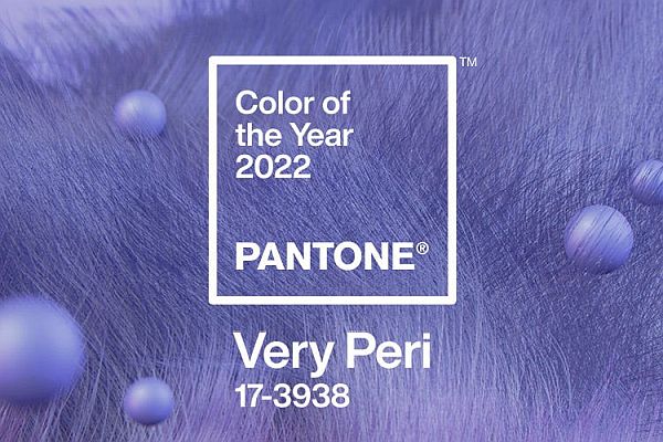
Pantone COTY (Colour of the Year) is decided annually by the business side of Pantone. This is the colour referencing organisation recognised all around the world. They use seasonal trends, forecasts and colour psychology. 2022’s colour was announced just before Christmas. The name? Very Peri. And their choice, they tell us, is:
“…to reflect what is taking place in our global culture. Expressing what people are looking for that colour can hope to answer”.
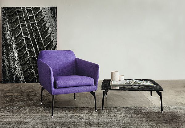
The colour of the Vibieffe Level armchair above, by the way, is not exactly Very Peri. Although it’s as near as damn it. That’s because Very Peri is a brand new colour not seen before. It’s more of a purple/red/blue combo. Or ‘blurple’ as it’s been nicknamed.
We have huge respect for the science behind colour forecasting and the work that goes into it. Because colour is such an emotional thing isn’t it? We tend to love it or hate it. Bottle green for one member of the Go Modern team will be forever associated with their school uniform for instance!
Do you allow colours to ‘grow on you’? Or are you quite ‘marmite’ about what you like and don’t? We think ultimately it’s all about what colours you put together. Moreover, too much of anything is definitely, in our opinion, quite a bold way to go.
A dazzling array of colours
Whether you love or hate 2022’s Pantone COTY we can talk colours with you. Many of our suppliers offer a dazzling array of lacquer finishes for their products. You tell us the reference number and they will do the rest. Colours can be matched across the whole of a design or, if you’re going for highlights, shades can be mixed and matched.
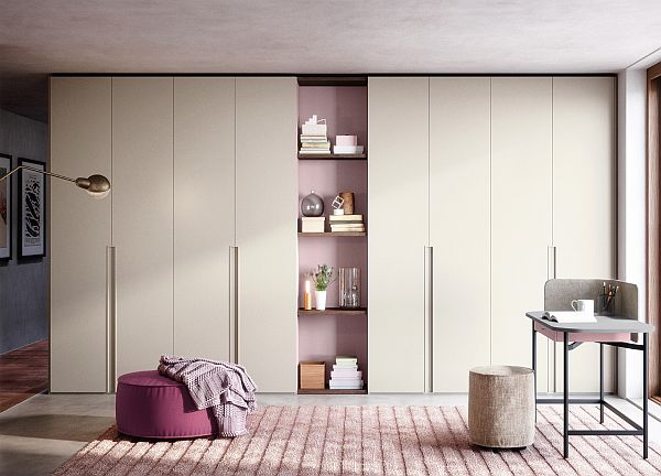
Our Italian manufacturer Novamobili are the kids on the block to go to for their huge range of lacquer finishes.
“We choose colours inspired by nature and its nuances and we introduce them everywhere , even inside wardrobes, to give our furniture a custom look, right down to its individual parts” – Novamoboli
Their Unika wardrobe above, for example, is finished in tortora matt lacquer. The shelves in the middle have cipria matt lacquered side panels with rovere brown shelves. Stunning isn’t it. The cipria shade used to highlight the shelving area has also been used on the drawers element of their Ninfea desk/dressing table. Similarly, the poufs have been covered in complementing shades that pull the whole scheme together beautifully.
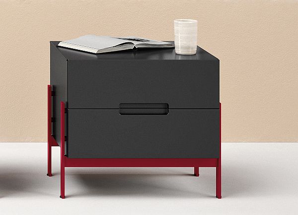
And highlighting isn’t just confined to larger pieces such as wardrobes. Another great example of what can be achieved to create a customised, unique look is a piece such as the Float bedside cabinet. Here the legs have been picked out in a bold contrasting colour. Brave? Yes. And absolutely fabulous however.
Working with Very Peri
It’s such a strong colour that it can be tricky to find complementing shades in that colour palette. The blue is the blue of the periwinkle flower. Then there’s the strong violet/red.
Pantone tell us it’s an ‘optimistic colour’ suggesting ‘new possibilities’. Blue represents security while red suggests vibrancy and change. Pantone’s Executive Director says:
“Very Peri displays a spritely joyous attitude and dynamic presence that encourages courageous creativity and imaginative expressions” – Leatrice Eiseman
Working with that amount of courage and dynamism is great… but. It suggests to us that, if you’re going to go for it, pairing with more neutral shades is probably the way to go.
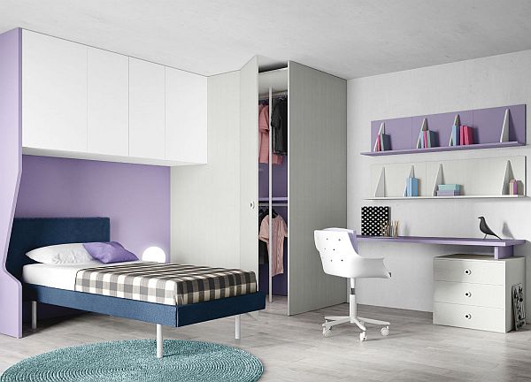
The Nidi Children’s bedroom composition above hits the mark we reckon. The purple shade used here (again, not Very Peri – but not far off) has been paired with pale neutrals and greys. Interestingly the sage green of the circular rug also works perfectly.
Naturals and neutrals
So we’d recommend naturals and neutral shades – elegant understated shades. Think greys, warm whites and sages.
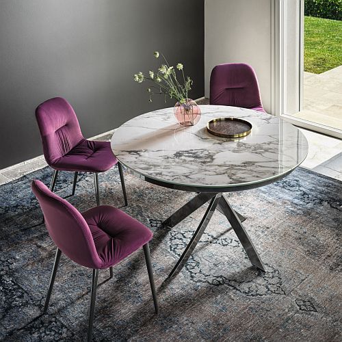
And voila! That’s exactly what Bontempi have chosen for styling the shoot of their new Chantal dining chairs.
They’re seen above in a sumptuous and very regal looking purplish velvet. It goes without saying that the range of fabrics for these chairs is huge. Choices include leather, eco-leather and pure wool. Bontempi opted for purple velvet for the shoot. In addition, they chose a backdrop of deep grey walls. The carpet too has a faded mix of grey/blue shades. The purple definitely gives the room a warmth that could be quite cold with anything less vibrant.
Colour your garden
Somewhere a burst of strong colour can work perfectly is the garden. In addition, you’re off to a heads start as you’re surrounded by naturals and neutrals.
Manutti’s Kumo range, for instance, is offered in a wide range of weather-proof fabrics. They also worked with an interior designer on this range to create six hand-picked colour combinations. Which takes the angst out of it for the rest of us.
So Very Peri and how to work it? Well in conclusion: Steady as she goes we say. More is less. And keep those neutrals close to hand.